Baking with MOUKA
-BRAND IDENTITY-
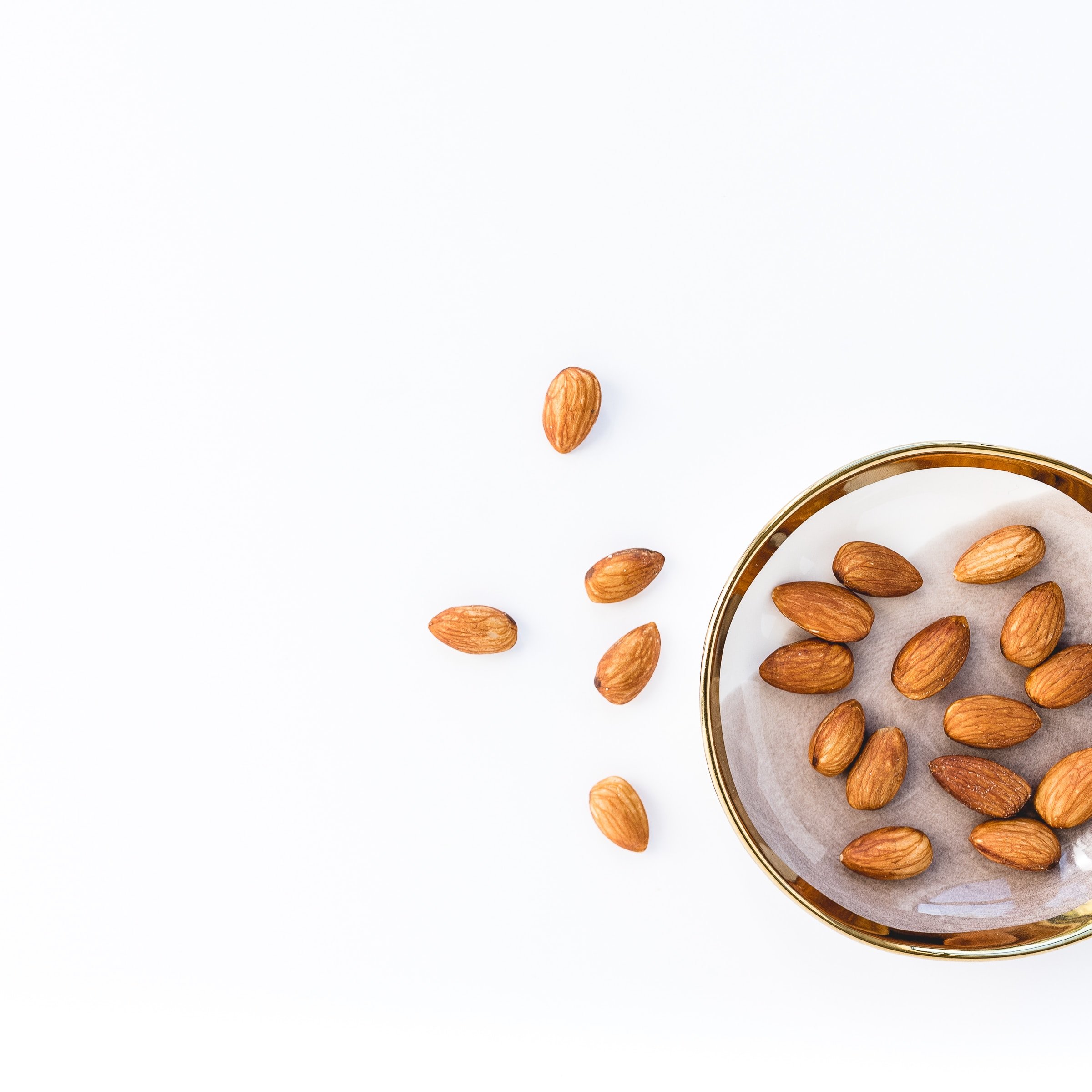
Table of contents
Mision & Vision
Logo
Mood board
Color Palette
Typography
Photography
Patterns
Branding/Mockups
Mission.
Mouka’s mission is to provide people with a simple and delicious baking mixes free of preservatives, excess sugar, or colorants. We want to provide not only great flavor, but an experience that people of all ages can enjoy; baking at home. We are dedicated to providing baking enthusiasts with high-quality baking mixes allowing them to savor the natural goodness of homemade treats without compromising on taste or nutrition.
Vision.
Our vision is rooted in the belief that every baking experience should be a joyful and wholesome journey, where families and friends can gather, create memories, and indulge in delightful moments. By meticulously crafting each baking mix with the utmost care, using the finest ingredients sourced from trusted suppliers, we aim to empower individuals to nourish their bodies with delightful creations that are as wholesome as they are scrumptious. Through our commitment to pure ingredients and the elimination of preservatives, we strive to inspire a baking revolution, one that celebrates the timeless art of baking while prioritizing the well-being of our customers.
Logo.
The idea for this logo came from hand drawing the name in a wavy typeface that creates a moving and flowy effect. A cupcake was added to the letter “A” adding a subtle element that communicates the essence of the business in a single glance.
PRIMARY
Usage: Social media posts, marketing campaigns, digital branding, high-quality printouts, and website.

SECONDARY
Usage: Black and white printouts, whenever a minimalist look is desired.

LOGO MARK
Usage: Social media profile icon, favicon, whenever there is only a small space available, long documents printouts.
Mood Board

Color Palette.


For this project, I derived our color palette from the vibrant hues of red and orange, as I wanted to create a fun and dynamic visual experience. Red, with its associations of energy and excitement, was chosen to inject a sense of passion and liveliness into the overall design.
Meanwhile, orange’s playful and cheerful nature complements red perfectly, adding a touch of warmth and enthusiasm. By combining these two colors, I aimed to evoke a sense of joy and creativity.

Typography.
Typefaces were carefully selected so that they seamlessly align with the overall design concept. The first typeface chosen expressed a sense of playfulness and adds a touch of whimsy to the visuals. With its wavy and dynamic forms, it beautifully echoes the essence of the logo, creating a harmonious and cohesive aesthetic.


As for the secondary typeface, I opted for a rounded and clear style. Its purpose was to enhance visibility, ensuring optimal legibility across various mediums. The design captivates the viewers with its charming and lively elements and also remains easily accessible and approachable.
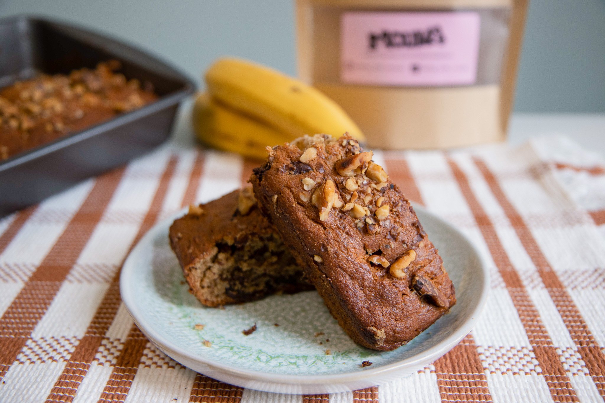
Photography.


Product & Merch Mockups.


Illustrations


〰️
〰️
Social Media Content


